Responsive Web
Mobile-First
E-Commerce
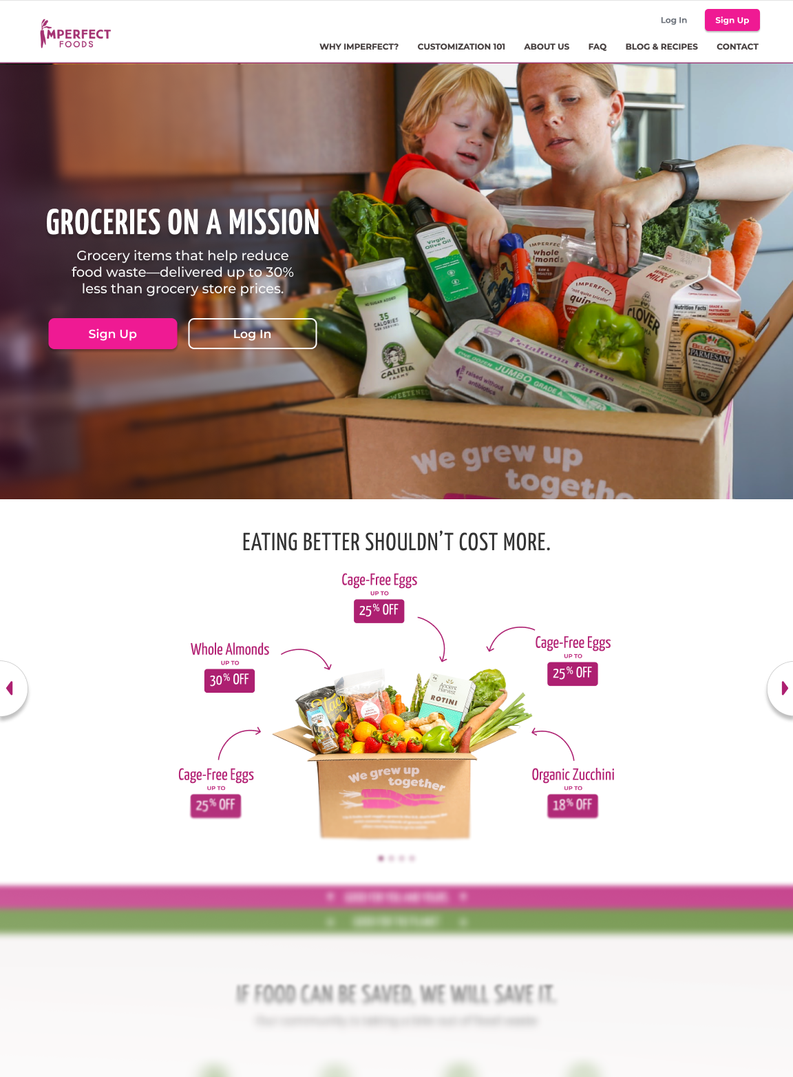
Imperfect Foods— Redesigning the Shopping Experience for Growth and Mobile
Expanding Imperfect Foods from produce boxes to a full grocery experience — making shopping clear, mobile-friendly, and frustration-free.
- Role: Product Designer
- Outcome: +18% average order volume, fewer support tickets, improved onboarding clarity
- Timeline: 2019-2020
The Challenge
A Store That Felt Closed
When Imperfect Foods expanded from produce boxes to a full grocery experience, the platform didn’t scale with it. Customers could only shop during limited “shopping windows”, but the app never made that clear. New users who signed up outside their window saw empty screens and often assumed the site was broken.
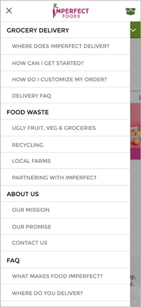
Navigation was confusing — shoppers couldn’t easily see all available products, view their window status, or manage their orders. Combined with a desktop-first layout and weak visual hierarchy, the experience felt broken and inaccessible on mobile.
- Confusing home screen with unclear shopping status
- Filters, categories, and curated sections have overlapping functions
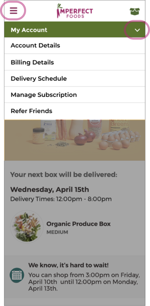
- Two navigation controls that confuse users.
- New users who joined outside of shopping window have nothing to do.
User research and support data confirmed these as top sources of friction — making clarity and hierarchy the focus of our redesign.
Research & Insights
Understand Where Users Got Stuck
Before redesigning, I wanted to understand why users felt lost during the shopping process. I reviewed major grocery platforms and analyzed Imperfect’s own support tickets and onboarding data.
Two key insights emerged:
- Users didn’t understand shopping windows. They expected a normal store, not one that opened and closed on a schedule.
- Users wanted something to do while waiting. Many tried to shop early and left frustrated when they couldn’t.
These findings directly informed our solutions — clear “shopping state” indicators, simplified navigation, and curated grocery packs that turned waiting into anticipation.
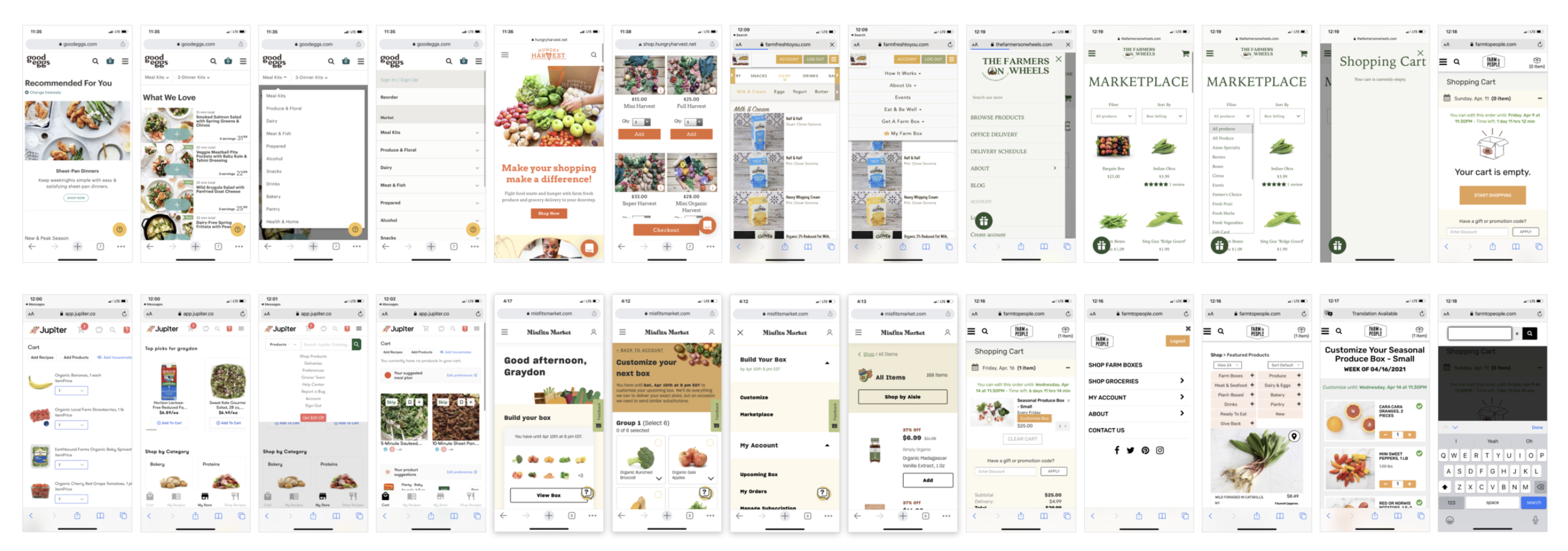
Competitor research on scheduling and shopping flows.
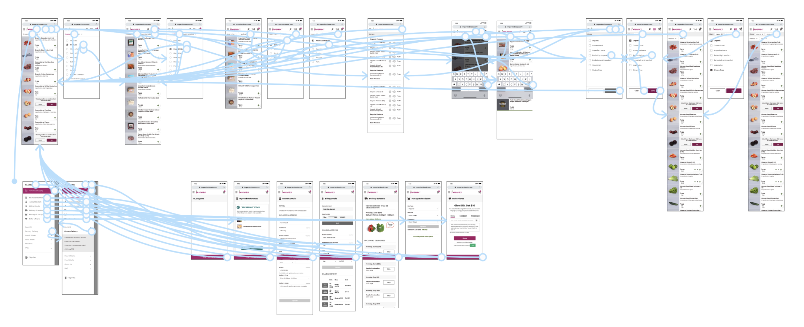
Testing interactive prototypes to validate clarity and flow.
The Approach
Turning Confusion Into Clarify
To fix the experience, I redesigned the entire shopping flow around clarity, guidance, and mobile-first usability.
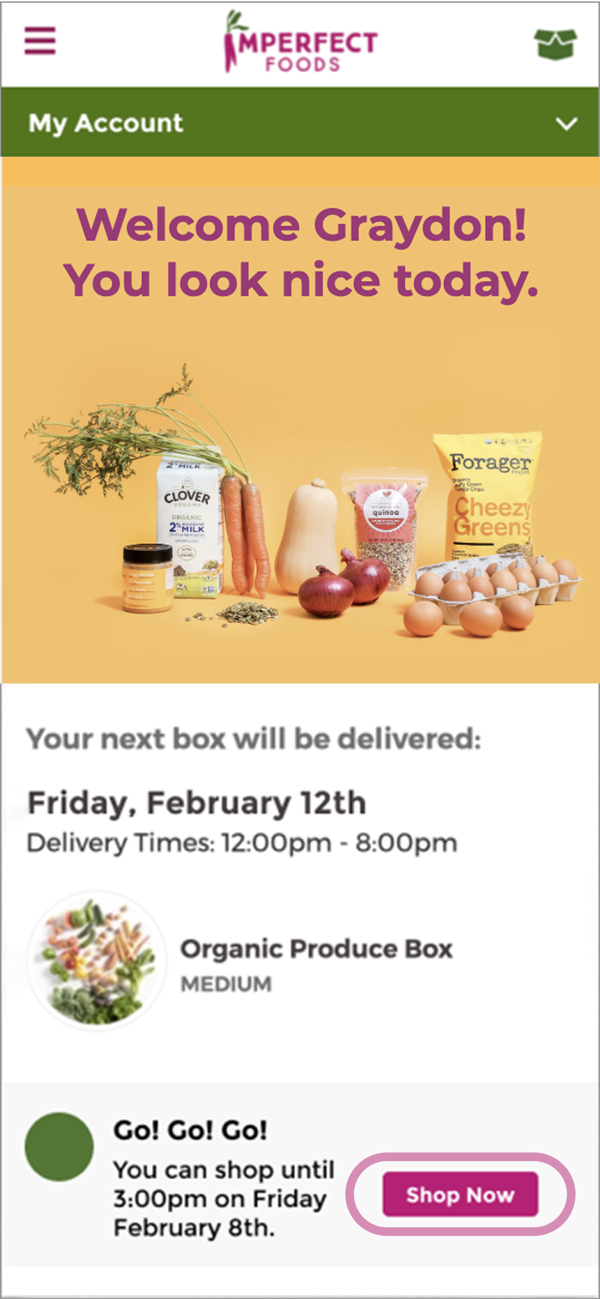
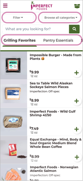
- Grocery Packs for New Users: Created curated “starter boxes” so users outside their window could explore and pre-fill their next order.
- Clear Shopping States: Added banners, color cues, and messaging to show when users could shop — eliminating guesswork.
- Simplified Navigation: Rebuilt the hierarchy so users always knew where they were and what actions were available.
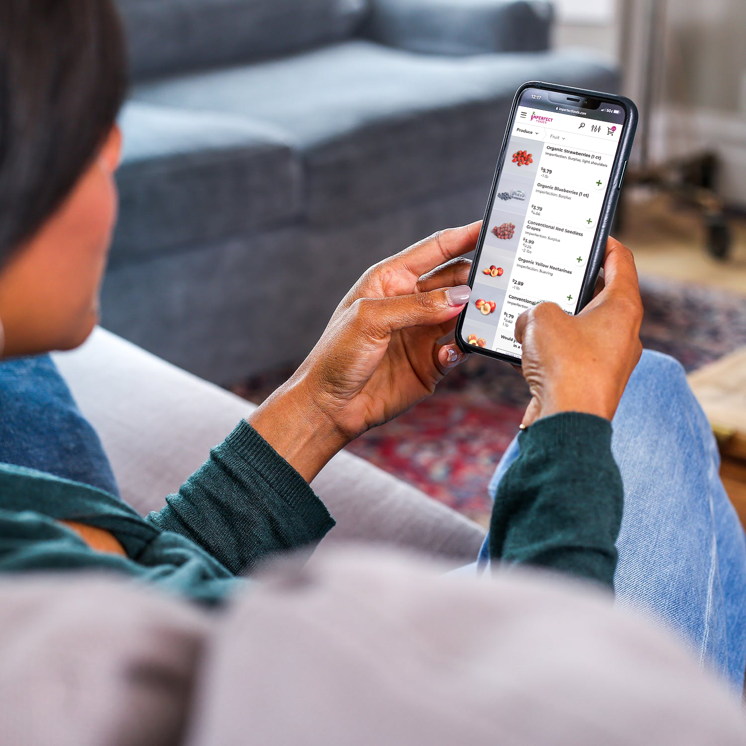
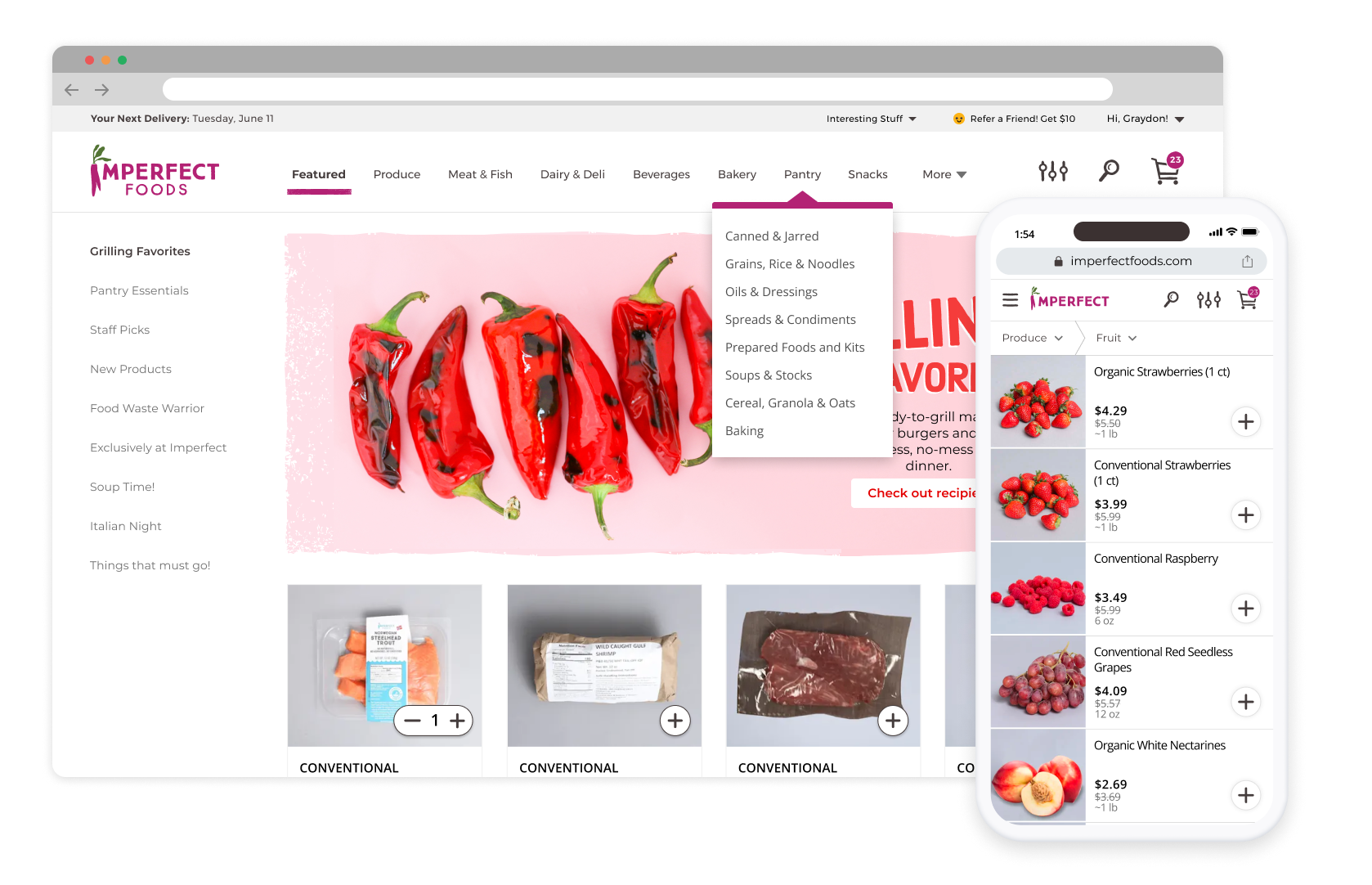
- Mobile-First Redesign: Reimagined the layout and interactions for mobile, aligning with Imperfect’s new brand identity.
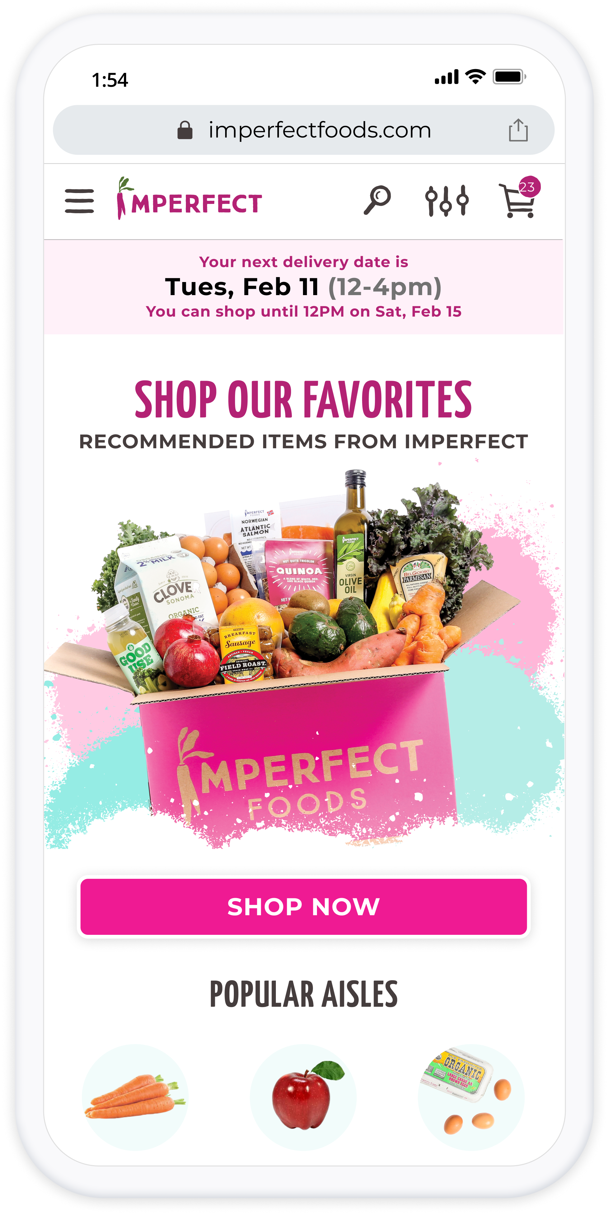
Clear banners show shopping window state
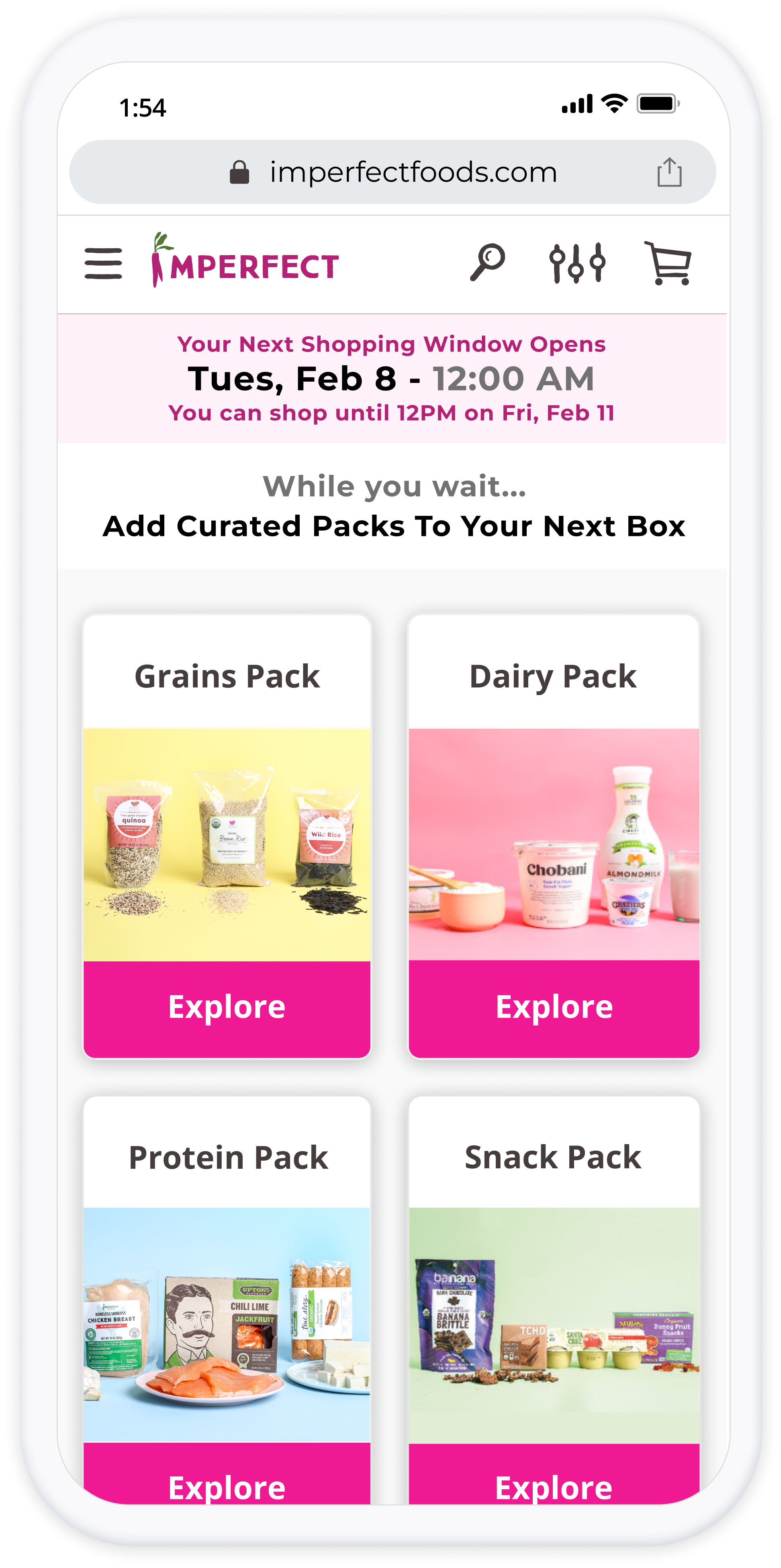
Starter Packs let users pre-shop while waiting
Simplified mobile navigation and hierarchy
Modern responsive design built for touch
The Results
Clarity That Drove Growth
The redesign simplified the user journey, made shopping windows intuitive, and brought Imperfect Foods’ experience up to the standard of a modern e-commerce platform.


Average Order Volume

18%

Support Tickets

Significantly

Mobile Engagement
Time spent
shopping

Company Approval

“It finally
feels modern”
The redesign became the foundation for Imperfect’s new design system.
Reflection
Setting the Tone for a Design Culture
This project taught me the importance of clarity — for both users and teams. Every improvement started by asking, “What problem are we solving?” and validating that through real feedback and data.
The redesign didn’t just modernize the shopping experience — it set the foundation for Imperfect’s design system and raised the visual and UX standards for every project that followed.


Responsive Web
Mobile-First
E-Commerce
Imperfect Foods— Redesigning the Shopping Experience for Growth and Mobile
Expanding Imperfect Foods from produce boxes to a full grocery experience — making shopping clear, mobile-friendly, and frustration-free.
- Role: Product Designer
- Outcome: +18% average order volume, fewer support tickets, improved onboarding clarity
- Timeline: 2019-2020
Research & Insights
Understand Where Users Got Stuck
Before redesigning, I wanted to understand why users felt lost during the shopping process. I reviewed major grocery platforms and analyzed Imperfect’s own support tickets and onboarding data.
Two key insights emerged:
- Users didn’t understand shopping windows. They expected a normal store, not one that opened and closed on a schedule.
- Users wanted something to do while waiting. Many tried to shop early and left frustrated when they couldn’t.
These findings directly informed our solutions — clear “shopping state” indicators, simplified navigation, and curated grocery packs that turned waiting into anticipation.
Competitor research on scheduling and shopping flows.
Testing interactive prototypes to validate clarity and flow.
The Approach
Turning Confusion Into Clarify
To fix the experience, I redesigned the entire shopping flow around clarity, guidance, and mobile-first usability.
- Grocery Packs for New Users: Created curated “starter boxes” so users outside their window could explore and pre-fill their next order.
- Clear Shopping States: Added banners, color cues, and messaging to show when users could shop — eliminating guesswork.
- Simplified Navigation: Rebuilt the hierarchy so users always knew where they were and what actions were available.
- Mobile-First Redesign: Reimagined the layout and interactions for mobile, aligning with Imperfect’s new brand identity.
Starter Packs let users pre-shop while waiting
Clear banners show shopping window state
Simplified mobile navigation and hierarchy
Modern responsive design built for touch
The Results
Clarity That Drove Growth
The redesign simplified the user journey, made shopping windows intuitive, and brought Imperfect Foods’ experience up to the standard of a modern e-commerce platform.
Average Order Volume
18%

Support Tickets
Significantly

Mobile Engagement
Time spent
shopping

Company Approval
“It finally
feels modern”
The redesign became the foundation for Imperfect’s new design system.
Reflection
Setting the Tone for a Design Culture
This project taught me the importance of clarity — for both users and teams. Every improvement started by asking, “What problem are we solving?” and validating that through real feedback and data.
The redesign didn’t just modernize the shopping experience — it set the foundation for Imperfect’s design system and raised the visual and UX standards for every project that followed.
Responsive Web
Mobile-First
E-Commerce
Imperfect Foods— Redesigning the Shopping Experience for Growth and Mobile
Expanding Imperfect Foods from produce boxes to a full grocery experience — making shopping clear, mobile-friendly, and frustration-free.
- Role: Product Designer
- Outcome: +18% average order volume, fewer support tickets, improved onboarding clarity
- Timeline: 2019-2020
The Challenge
A Store That Felt Closed
When Imperfect Foods expanded from produce boxes to a full grocery experience, the platform didn’t scale with it. Customers could only shop during limited “shopping windows”, but the app never made that clear. New users who signed up outside their window saw empty screens and often assumed the site was broken.
Navigation was confusing — shoppers couldn’t easily see all available products, view their window status, or manage their orders. Combined with a desktop-first layout and weak visual hierarchy, the experience felt broken and inaccessible on mobile.
- Confusing home screen with unclear shopping status
- Filters, categories, and curated sections have overlapping functions
- Two navigation controls that confuse users.
- New users who joined outside of shopping window have nothing to do.
User research and support data confirmed these as top sources of friction — making clarity and hierarchy the focus of our redesign.
Research & Insights
Understand Where Users Got Stuck
Before redesigning, I wanted to understand why users felt lost during the shopping process. I reviewed major grocery platforms and analyzed Imperfect’s own support tickets and onboarding data.
Two key insights emerged:
- Users didn’t understand shopping windows. They expected a normal store, not one that opened and closed on a schedule.
- Users wanted something to do while waiting. Many tried to shop early and left frustrated when they couldn’t.
These findings directly informed our solutions — clear “shopping state” indicators, simplified navigation, and curated grocery packs that turned waiting into anticipation.
Competitor research on scheduling and shopping flows.
Testing interactive prototypes to validate clarity and flow.
The Approach
Turning Confusion Into Clarify
To fix the experience, I redesigned the entire shopping flow around clarity, guidance, and mobile-first usability.
- Grocery Packs for New Users: Created curated “starter boxes” so users outside their window could explore and pre-fill their next order.
- Clear Shopping States: Added banners, color cues, and messaging to show when users could shop — eliminating guesswork.
- Simplified Navigation: Rebuilt the hierarchy so users always knew where they were and what actions were available.
- Mobile-First Redesign: Reimagined the layout and interactions for mobile, aligning with Imperfect’s new brand identity.
Starter Packs let users pre-shop while waiting
Clear banners show shopping window state
Simplified mobile navigation and hierarchy
Modern responsive design built for touch
The Results
Clarity That Drove Growth
The redesign simplified the user journey, made shopping windows intuitive, and brought Imperfect Foods’ experience up to the standard of a modern e-commerce platform.
Average Order Volume
18%

Support Tickets
Significantly

Mobile Engagement
Time spent
shopping

Company Approval

“It finally
feels modern”
The redesign became the foundation for Imperfect’s new design system.
Reflection
Setting the Tone for a Design Culture
This project taught me the importance of clarity — for both users and teams. Every improvement started by asking, “What problem are we solving?” and validating that through real feedback and data.
The redesign didn’t just modernize the shopping experience — it set the foundation for Imperfect’s design system and raised the visual and UX standards for every project that followed.