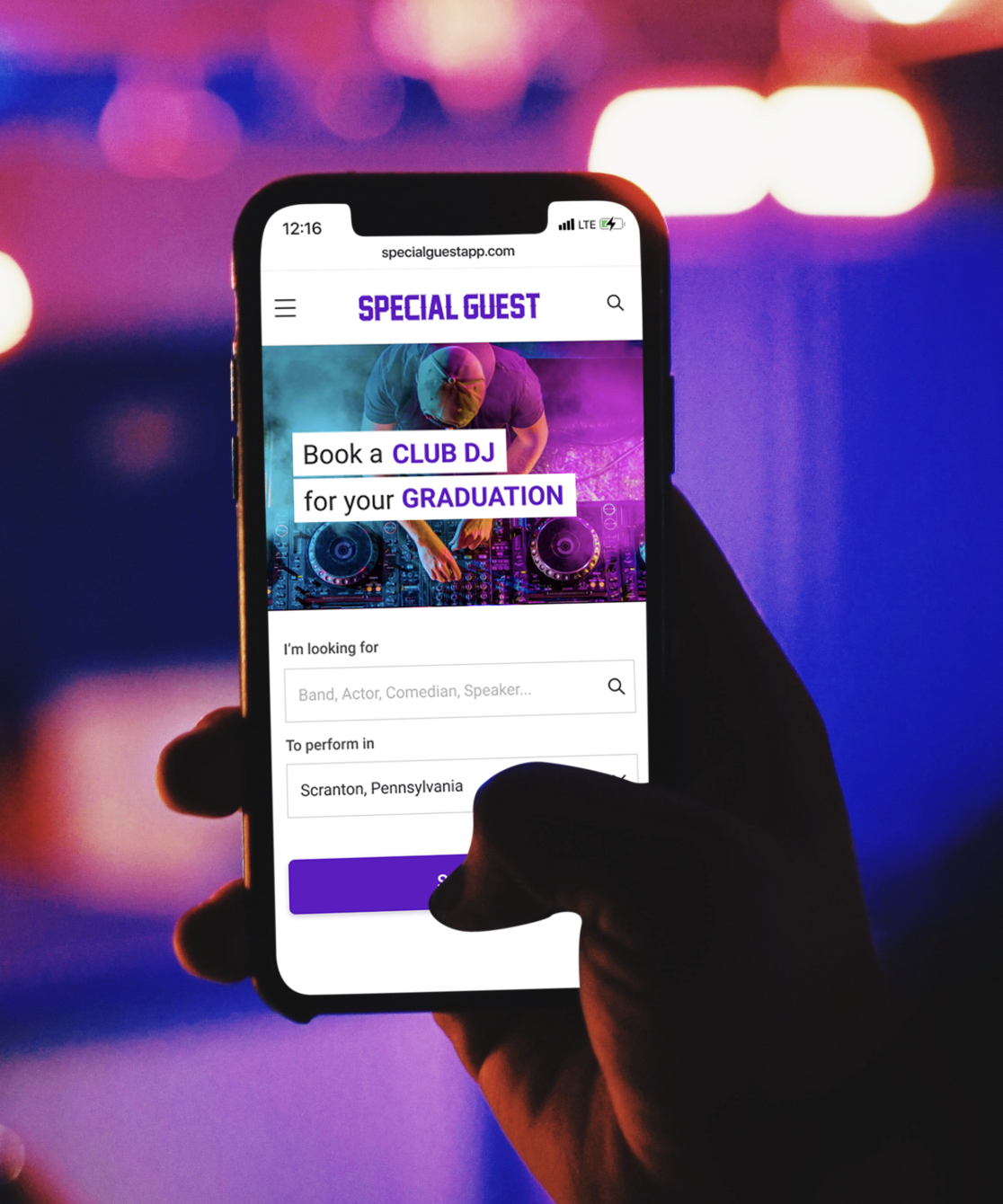
Responsive Web
Mobile-First
E-Commerce
Special Guest— Redesigning a Marketplace for Live Entertainment
Special Guest connects performers with event organizers — think “Airbnb for entertainers.” When I joined, the product had promise but poor usability: confusing navigation, dated visuals, and a clunky mobile experience. My goal was to redesign the marketplace for clarity, trust, and delight.
- Role: Product Designer– led end-to-end redesign of web marketplace and design system (mobile-first)
- Outcome: Increased engagement and navigation clarity through improved information architecture, responsive UI, and unified design system
- Timeline: 2021 – 2022
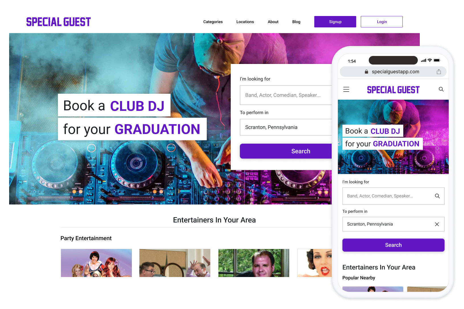

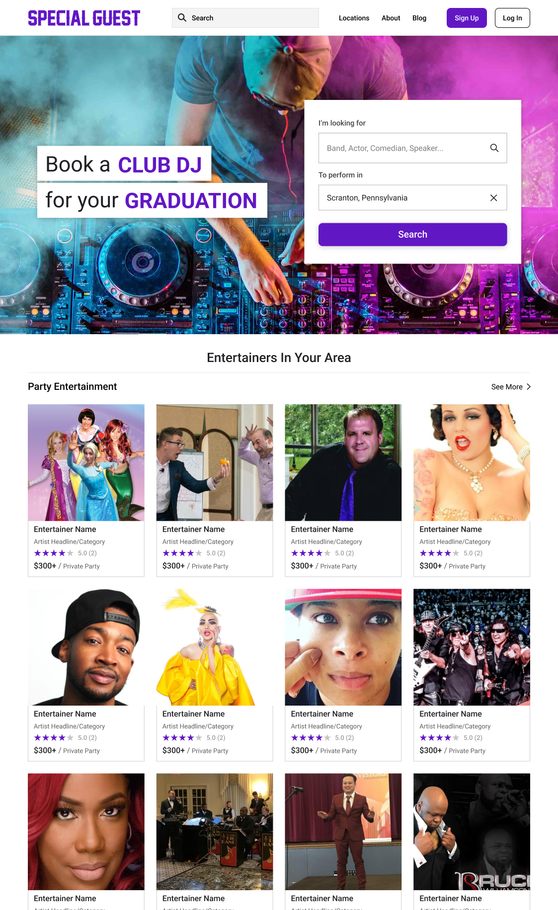
The image and copy would rotate showing users different scenarios and events for which the user could book an entertainer, rather than thinking the site was only for one kind of event.
The Challenge
Reviving a Live-Entertainment Marketplace After the Pandemic Pause
When live events returned after lockdowns, Special Guest needed a comeback. The marketplace worked, but the interface—originally designed by the PM—felt outdated and unpolished. It didn’t inspire trust or reflect a professional booking service.
Navigation was suboptimal, performer discovery was difficult, and the checkout flow needed improvements. My role was to update the brand, modernize the UI, and make booking performers simple and delightful—especially on mobile.
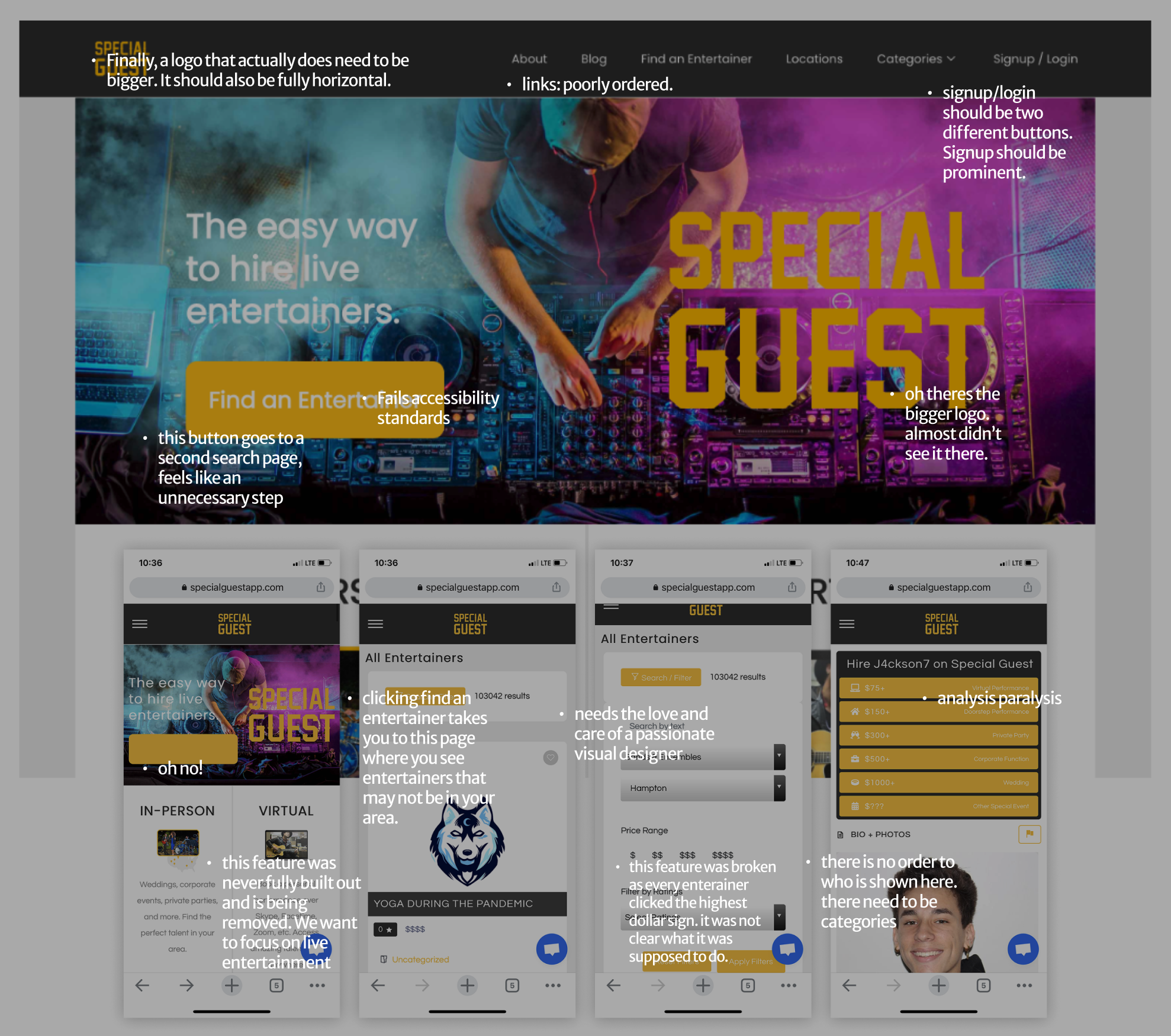
Designed by PM, worked but needed a dedicated designer to worry about the details and user experience.
Research & Insights
Finding Where Users Lost Confidence
After the pandemic, Special Guest needed a visual and usability overhaul to attract users back to live entertainment. The product worked — but it looked MVP, with confusing performer categories, dense location lists, and a chaotic booking flow that felt unreliable. To rebuild trust, I focused on visual clarity, hierarchy, and cohesion — modernizing the interface and laying the foundations for a unified design system across mobile and web.


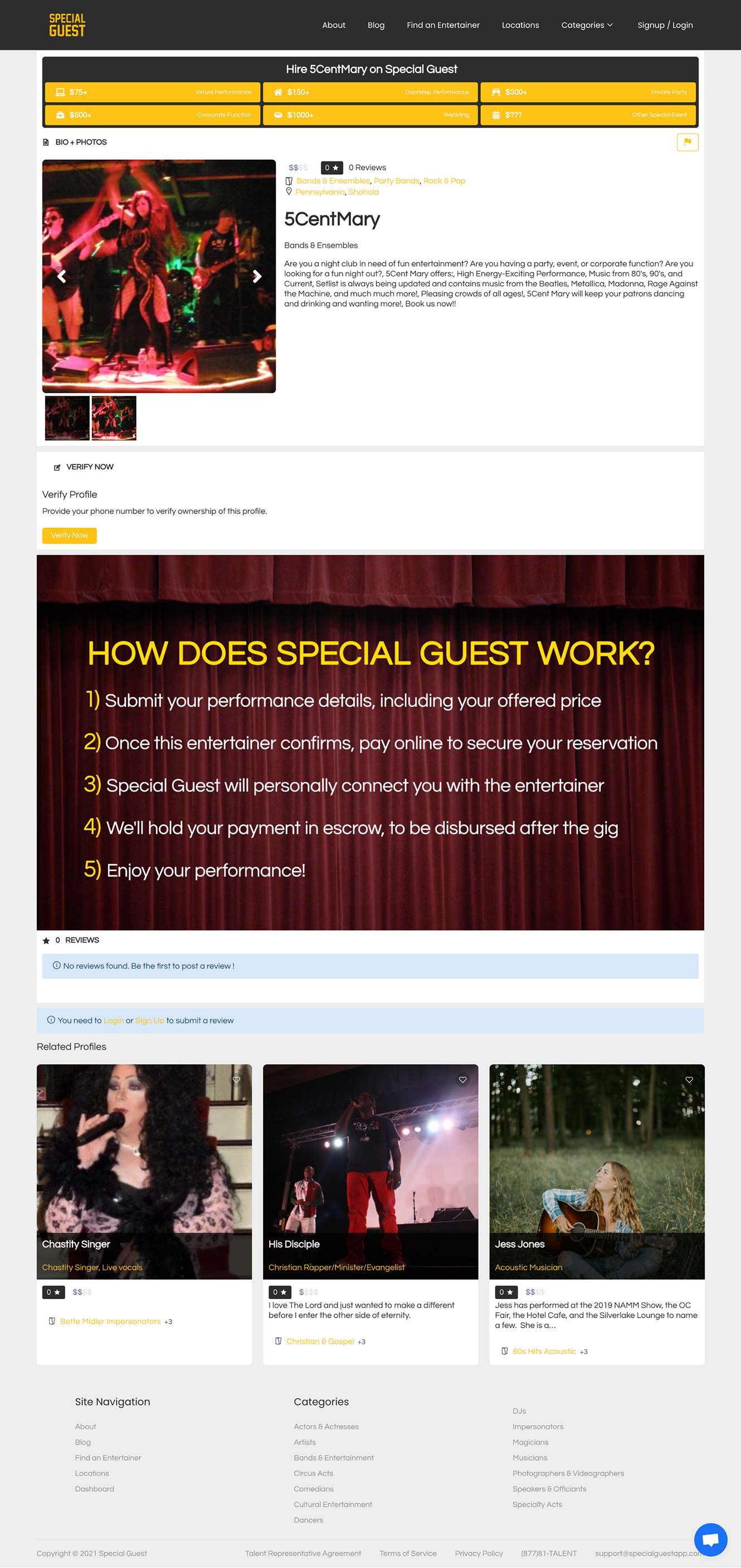
- The categories list was not scannable.
- The locations section, built for SEO, was a massive wall of text.
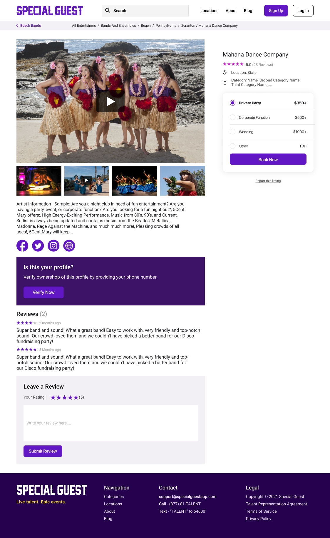
- The booking page felt cluttered and untrustworthy on mobile.
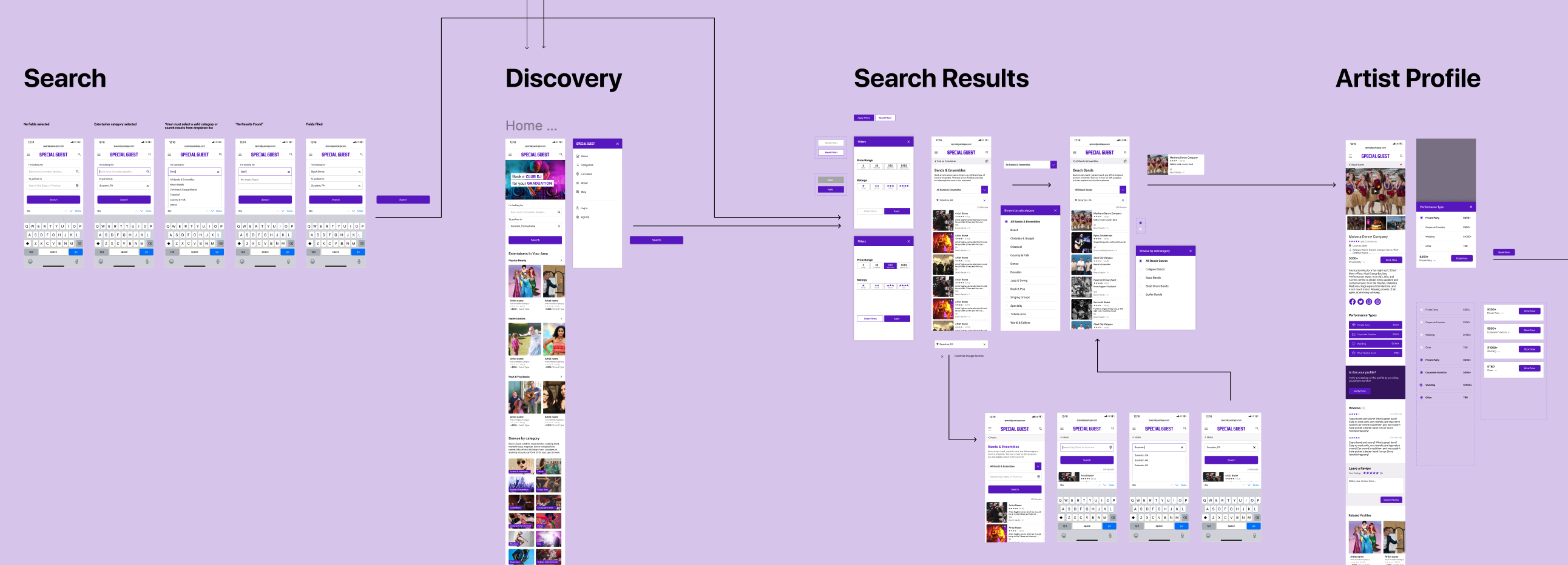
- Mobile-First Redesign: Reimagined the layout and interactions for mobile, aligning with Imperfect’s new brand identity.
These small frictions compounded into one clear insight: the site worked, but it didn’t feel intuitive or reliable. The redesign needed to rebuild confidence through clarity, hierarchy, and visual polish.
Design System & Rebranding
Building a Scalable Design System for a Reborn Marketplace
The old UI had no consistent hierarchy, spacing, or type system — every screen felt designed in isolation. I rebuilt the product from the ground up with a modular design system that unified colors, type, spacing, and components across web and mobile.
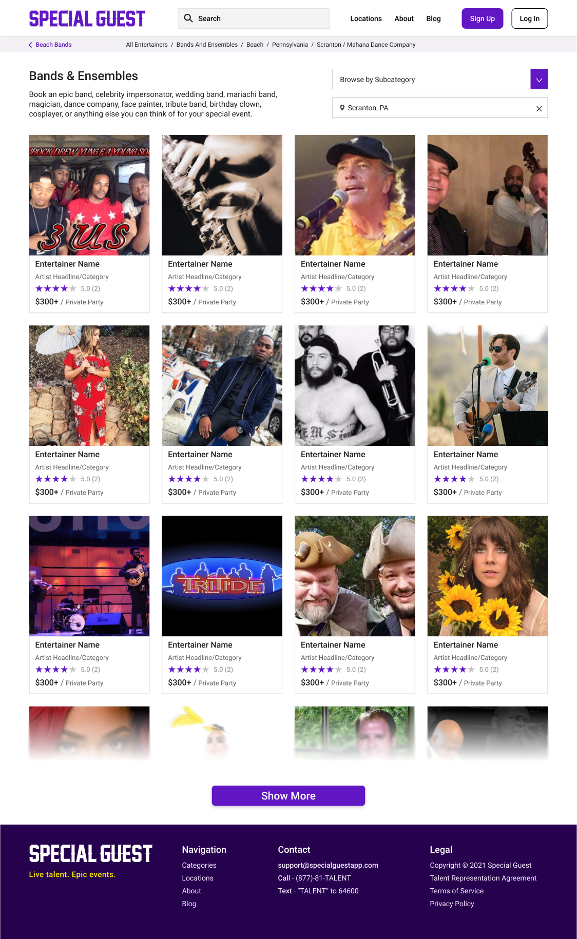
- Streamline performer discovery with clear, image-first cards.
- Modernize the color palette and typography to feel premium and professional.
- Align marketing and product surfaces for brand consistency.
The new design gave users confidence that Special Guest was a serious, trustworthy platform — not a side project. It also made it dramatically easier for engineers to ship updates faster and stay on-brand.
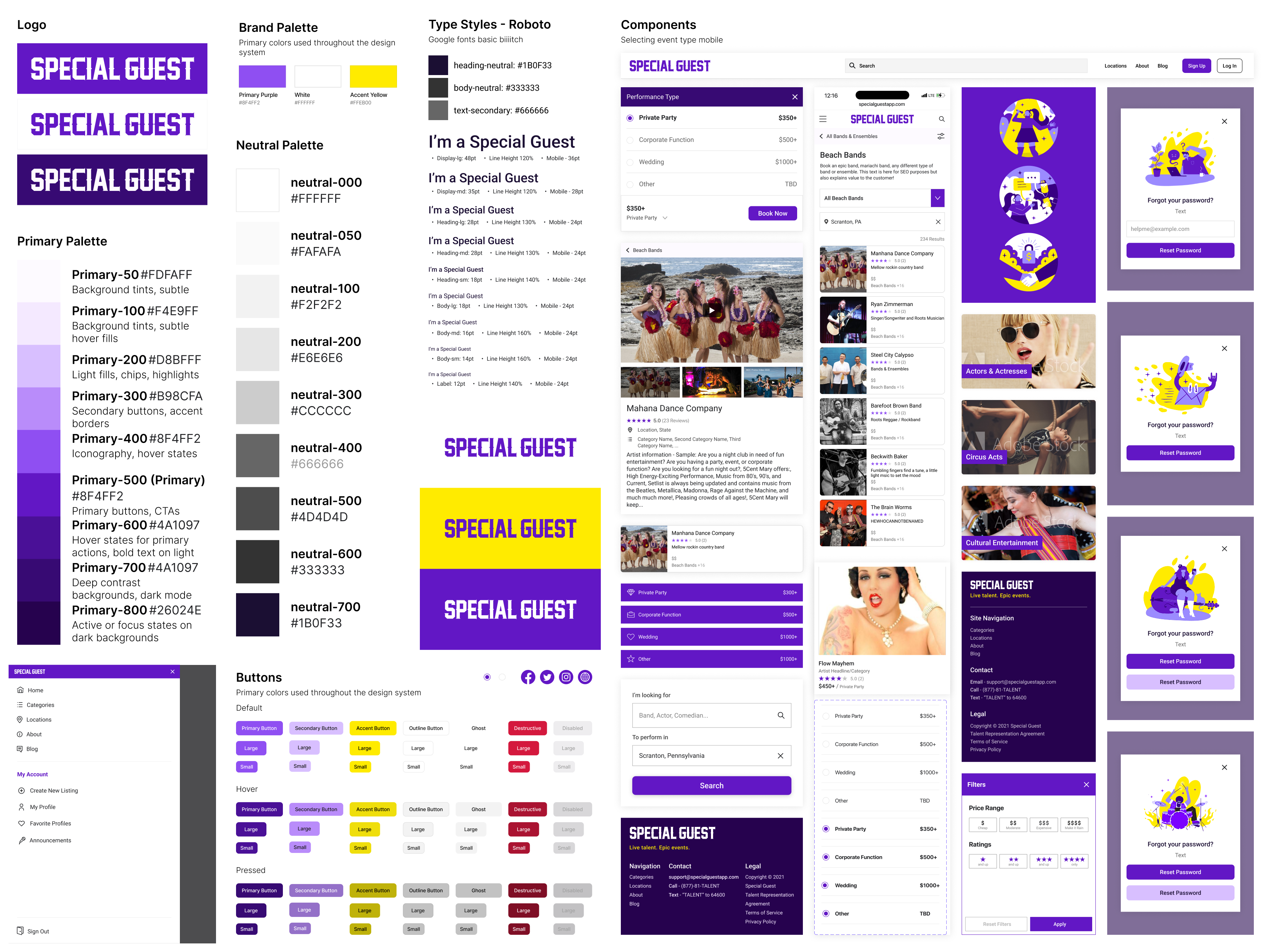
Foundational elements for the Special Guest design system — bridging marketing and product through consistent visual language.
The Results
A Foundation That Builds Trust
The redesign gave Special Guest a professional, cohesive identity and restored user confidence after the pandemic shutdown. By aligning the product’s visual language and UX patterns, we made it easier for both performers and event organizers to browse, compare, and book talent—especially on mobile. The new design system unified the brand across platforms and allowed engineering to ship faster with fewer visual inconsistencies.
Outcomes:
- Cohesive, modern UI that matched the energy of live entertainment
- Clear navigation and performer discovery on mobile
- Rebuilt trust with users returning to live events
- Set the tone for the company’s brand and personality
Reflection
Consistency Builds Confidence
This project showed me how much design systems not only organize components but more importantly they build trust. When every interaction feels consistent and every element speaks the same visual language, users stop questioning the interface and start engaging with what matters. For the team, the system became a shared foundation that sped up development, aligning marketing and product, and giving the entire company a clearer sense of identity.


Responsive Web
Mobile-First
E-Commerce
Special Guest— Redesigning a Marketplace for Live Entertainment
Special Guest connects performers with event organizers — think “Airbnb for entertainers.” When I joined, the product had promise but poor usability: confusing navigation, dated visuals, and a clunky mobile experience. My goal was to redesign the marketplace for clarity, trust, and delight.
- Role: Product Designer– led end-to-end redesign of web marketplace and design system (mobile-first)
- Outcome: Increased engagement and navigation clarity through improved information architecture, responsive UI, and unified design system
- Timeline: 2021 – 2022


The image and copy would rotate showing users different scenarios and events for which the user could book an entertainer, rather than thinking the site was only for one kind of event.
The Challenge
Reviving a Live-Entertainment Marketplace After the Pandemic Pause
When live events returned after lockdowns, Special Guest needed a comeback. The marketplace worked, but the interface—originally designed by the PM—felt outdated and unpolished. It didn’t inspire trust or reflect a professional booking service.
Navigation was suboptimal, performer discovery was difficult, and the checkout flow needed improvements. My role was to update the brand, modernize the UI, and make booking performers simple and delightful—especially on mobile.

Designed by PM, worked but needed a dedicated designer to worry about the details and user experience.
Research & Insights
Identifying Friction in Discovery and Booking
Through quick usability sessions and internal data review, we found users were getting lost in the basics: performer discovery and checkout.


- The categories list was not scannable
- The locations section, built for SEO, was a massive wall of text.
- The booking page felt cluttered and untrustworthy on mobile.
- Mobile-First Redesign: Reimagined the layout and interactions for mobile, aligning with Imperfect’s new brand identity.
These small frictions compounded into one clear insight: the site worked, but it didn’t feel intuitive or reliable. The redesign needed to rebuild confidence through clarity, hierarchy, and visual polish.
Design System & Rebranding
Building a Scalable Design System for a Reborn Marketplace
The old UI had no consistent hierarchy, spacing, or type system — every screen felt designed in isolation. I rebuilt the product from the ground up with a modular design system that unified colors, type, spacing, and components across web and mobile.
- Streamline performer discovery with clear, image-first cards.
- Modernize the color palette and typography to feel premium and professional.
- Align marketing and product surfaces for brand consistency.
The new design gave users confidence that Special Guest was a serious, trustworthy platform — not a side project. It also made it dramatically easier for engineers to ship updates faster and stay on-brand.

Foundational elements for the Special Guest design system — bridging marketing and product through consistent visual language.
The Results
A Foundation That Builds Trust
The redesign gave Special Guest a professional, cohesive identity and restored user confidence after the pandemic shutdown. By aligning the product’s visual language and UX patterns, we made it easier for both performers and event organizers to browse, compare, and book talent—especially on mobile. The new design system unified the brand across platforms and allowed engineering to ship faster with fewer visual inconsistencies.
Outcomes:
- Cohesive, modern UI that matched the energy of live entertainment
- Clear navigation and performer discovery on mobile
- Rebuilt trust with users returning to live events
- Set the tone for the company’s brand and personality
Reflection
Consistency Builds Confidence
This project showed me how much design systems not only organize components but more importantly they build trust. When every interaction feels consistent and every element speaks the same visual language, users stop questioning the interface and start engaging with what matters. For the team, the system became a shared foundation that sped up development, aligning marketing and product, and giving the entire company a clearer sense of identity.


Responsive Web
Mobile-First
E-Commerce
Special Guest— Redesigning a Marketplace for Live Entertainment
Special Guest connects performers with event organizers — think “Airbnb for entertainers.” When I joined, the product had promise but poor usability: confusing navigation, dated visuals, and a clunky mobile experience. My goal was to redesign the marketplace for clarity, trust, and delight.
- Role: Product Designer– led end-to-end redesign of web marketplace and design system (mobile-first)
- Outcome: Increased engagement and navigation clarity through improved information architecture, responsive UI, and unified design system
- Timeline: 2021 – 2022


The image and copy would rotate showing users different scenarios and events for which the user could book an entertainer, rather than thinking the site was only for one kind of event.
The Challenge
Reviving a Live-Entertainment Marketplace After the Pandemic Pause
When live events returned after lockdowns, Special Guest needed a comeback. The marketplace worked, but the interface—originally designed by the PM—felt outdated and unpolished. It didn’t inspire trust or reflect a professional booking service.
Navigation was suboptimal, performer discovery was difficult, and the checkout flow needed improvements. My role was to update the brand, modernize the UI, and make booking performers simple and delightful—especially on mobile.

Designed by PM, worked but needed a dedicated designer to worry about the details and user experience.
Research & Insights
Finding Where Users Lost Confidence
After the pandemic, Special Guest needed a visual and usability overhaul to attract users back to live entertainment. The product worked — but it looked MVP, with confusing performer categories, dense location lists, and a chaotic booking flow that felt unreliable. To rebuild trust, I focused on visual clarity, hierarchy, and cohesion — modernizing the interface and laying the foundations for a unified design system across mobile and web.


- The categories list was not scannable
- The locations section, built for SEO, was a massive wall of text.
- The booking page felt cluttered and untrustworthy on mobile.
- Mobile-First Redesign: Reimagined the layout and interactions for mobile, aligning with Imperfect’s new brand identity.
These small frictions compounded into one clear insight: the site worked, but it didn’t feel intuitive or reliable. The redesign needed to rebuild confidence through clarity, hierarchy, and visual polish.
Design System & Rebranding
Building a Scalable Design System for a Reborn Marketplace
The old UI had no consistent hierarchy, spacing, or type system — every screen felt designed in isolation. I rebuilt the product from the ground up with a modular design system that unified colors, type, spacing, and components across web and mobile.
- Streamline performer discovery with clear, image-first cards.
- Modernize the color palette and typography to feel premium and professional.
- Align marketing and product surfaces for brand consistency.
The new design gave users confidence that Special Guest was a serious, trustworthy platform — not a side project. It also made it dramatically easier for engineers to ship updates faster and stay on-brand.

Foundational elements for the Special Guest design system — bridging marketing and product through consistent visual language.
The Results
A Foundation That Builds Trust
The redesign gave Special Guest a professional, cohesive identity and restored user confidence after the pandemic shutdown. By aligning the product’s visual language and UX patterns, we made it easier for both performers and event organizers to browse, compare, and book talent—especially on mobile. The new design system unified the brand across platforms and allowed engineering to ship faster with fewer visual inconsistencies.
Outcomes:
- Cohesive, modern UI that matched the energy of live entertainment
- Clear navigation and performer discovery on mobile
- Rebuilt trust with users returning to live events
- Set the tone for the company’s brand and personality
Reflection
Consistency Builds Confidence
This project showed me how much design systems not only organize components but more importantly they build trust. When every interaction feels consistent and every element speaks the same visual language, users stop questioning the interface and start engaging with what matters. For the team, the system became a shared foundation that sped up development, aligning marketing and product, and giving the entire company a clearer sense of identity.
