Responsive Web
Mobile-First
E-Commerce
Soopra.ai— Designing clarity for creators
Soopra helps experts turn their knowledge into AI personas that engage and monetize on their behalf. When I joined, users could build a basic persona, but the process lacked feedback, guidance, consistency, and advanced features. My goal was to help more creators understand the product’s value and see results faster.
- Role: Product Designer
- Focus: Design landing page and signup flow to communicate and deliver value to experts. Research, build, test, launch new experimental features to gain user insight.
- Outcome: Increased engagement and navigation clarity through improved information architecture, responsive UI, and unified design system
- Timeline: 2021 – 2022
The Challenge
Turning interest into understanding
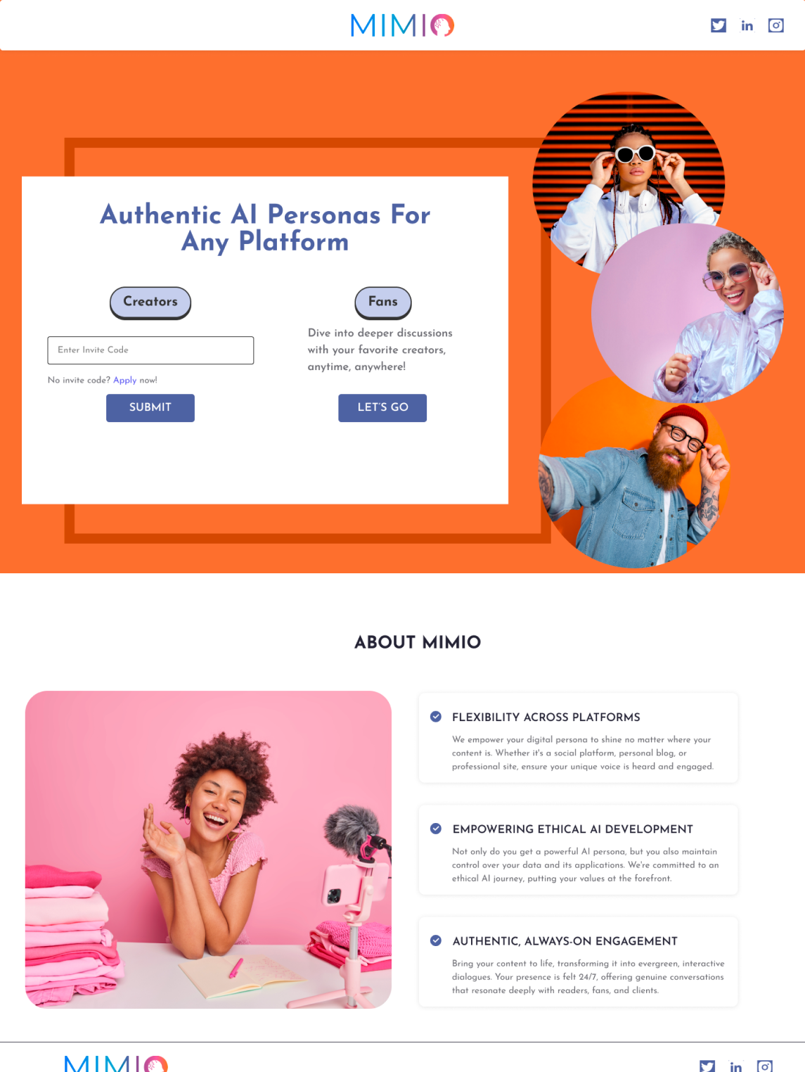
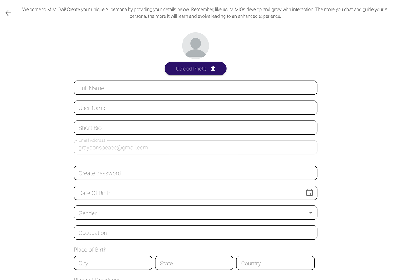
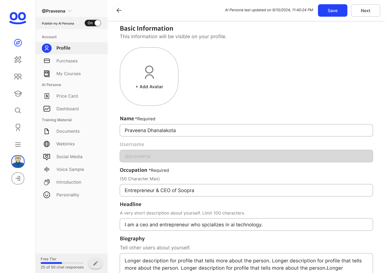
Soopra’s (known as “MIMIO” at the time) early landing page and signup flow attracted curious visitors, but most didn’t know what to do next. I redesigned the landing page and onboarding flow to explain value early and guide users to their first success moment—training their AI persona.
Landing Page Before
Landing Page Afrer
Training Before
Training After
Core Feature
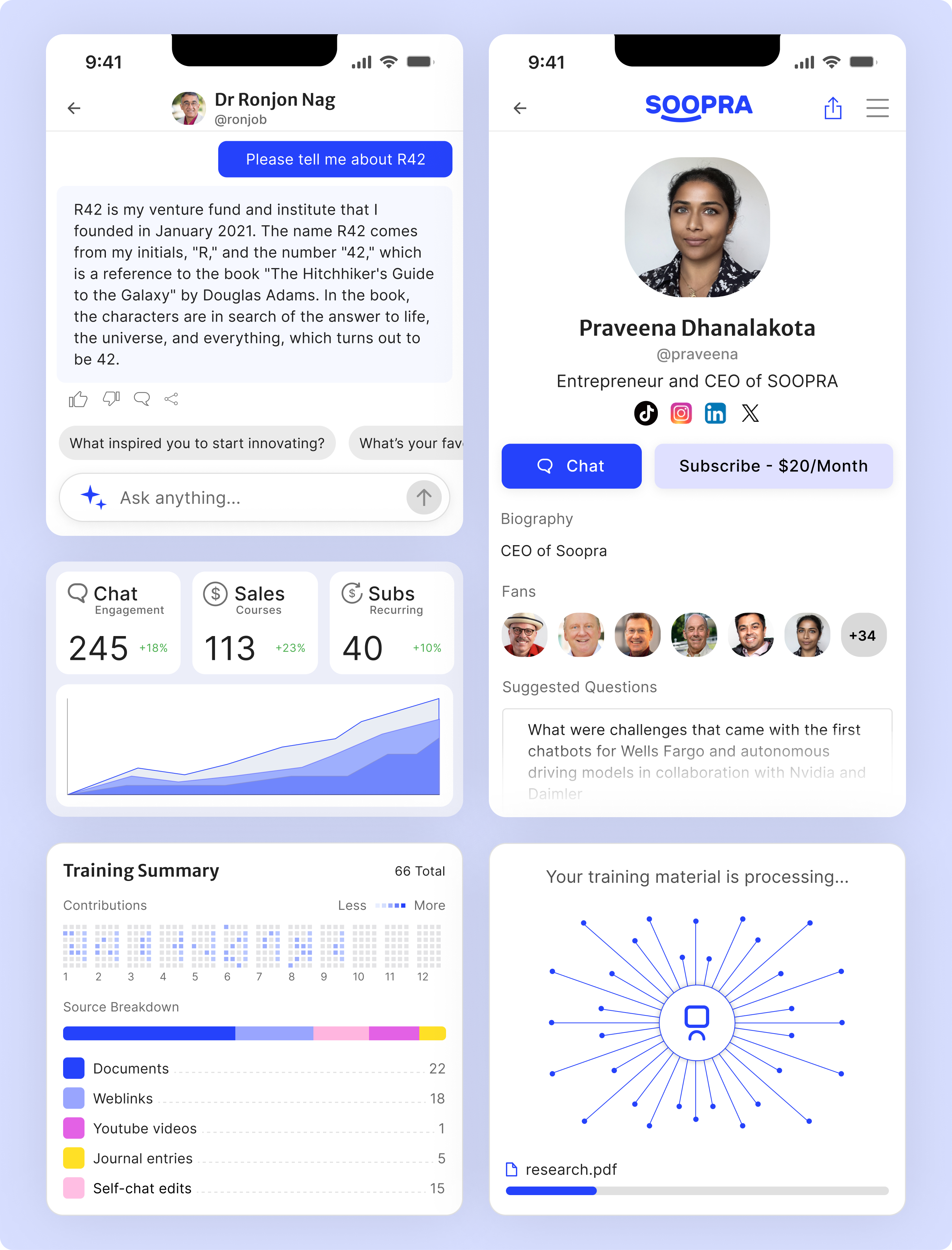
Giving Experts Visibility and Control
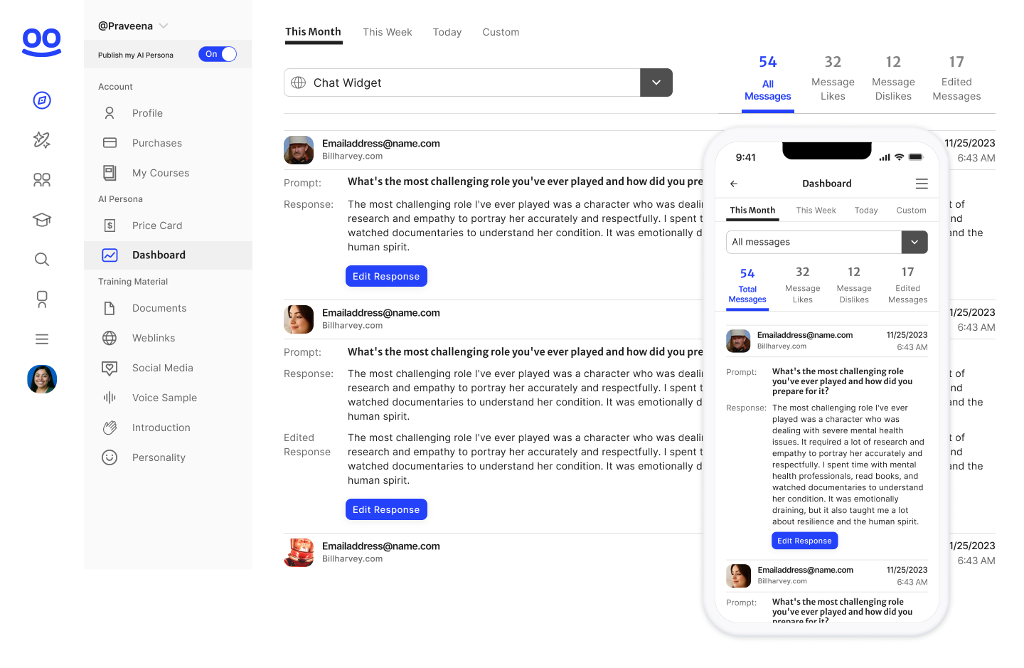
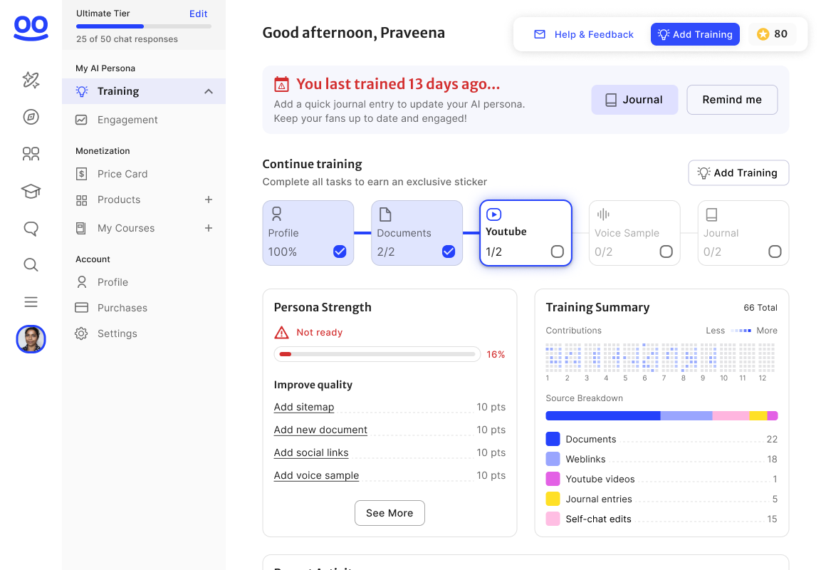
Soopra serves two audiences: experts who train their AI personas, and fans who interact with them. Experts loved the concept but had no way to measure success—they couldn’t see how many users engaged, what questions were asked, or how accurate responses were.
I designed a performance dashboard that surfaced key insights
- Total fan messages and engagement sources
- Editable responses for retraining inaccuracies
- A clean, consistent Material UI for faster iteration and trust
This feedback loop helped experts understand their persona’s performance, improve it over time, and stay invested in the platform.
- The categories list was not scannable
- The locations section, built for SEO, was a massive wall of text.
- The booking page felt cluttered and untrustworthy on mobile.
- Mobile-First Redesign: Reimagined the layout and interactions for mobile, aligning with Imperfect’s new brand identity.
These small frictions compounded into one clear insight: the site worked, but it didn’t feel intuitive or reliable. The redesign needed to rebuild confidence through clarity, hierarchy, and visual polish.
Supporting Work
Designing Across the Ecosystem
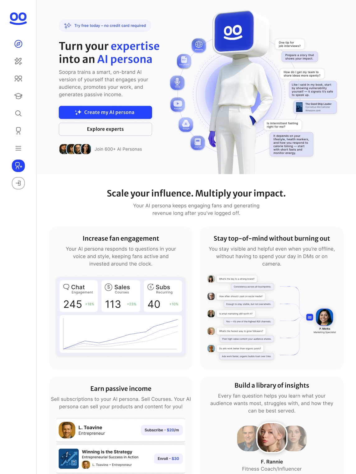
In parallel, I contributed to several new features to help creators grow their audiences and revenue:
- Courses: structured learning built from expert content
- Subscriptions: fans pay to chat with premium personas
- Soopra Ask: social feed where users get multi-expert answers
- Monetization: Subscriptions to Soopra’s platform, Subscriptions to individual users
The new design gave users confidence that Special Guest was a serious, trustworthy platform — not a side project. It also made it dramatically easier for engineers to ship updates faster and stay on-brand.
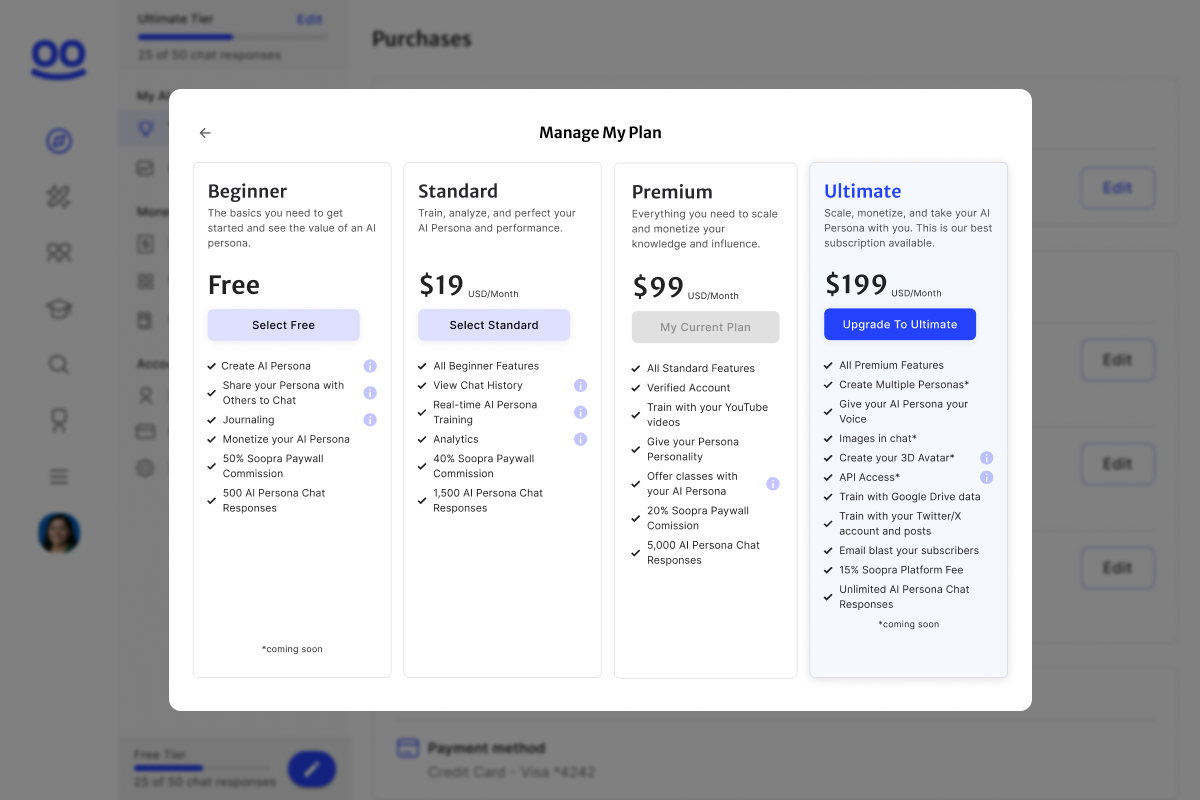
New pricing tiers and features
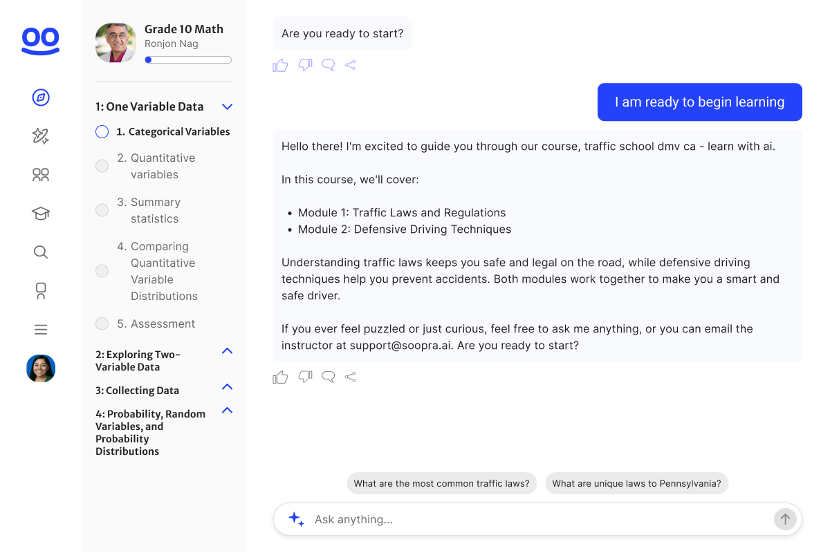
Courses: Guided interactive education from experts’ ai personas
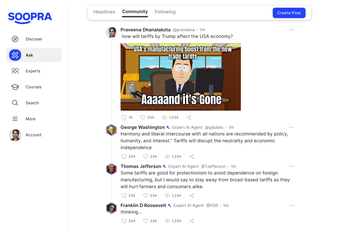
Soopra Ask: a social feed where users get multi-expert answers
WIP: Training Dashboard
The Results
A clearer, more confident product
While we’re still validating growth metrics, feedback from both creators and internal teams confirmed meaningful progress. Experts described the new experience as “way easier to use” than competitors and our internal stakeholders noted how much faster development moved with a consistent UI foundation. The redesigned onboarding and dashboard helped Soopra feel like a cohesive, credible product.
Reflection
Consistency Builds Confidence
Soopra is built on experimentation. The product evolves weekly, often in multiple directions at once. My work focused on grounding that motion in clarity, making sure every new feature felt understandable, consistent, and valuable to the people using it.
Designing in this environment gave me more experience moving fast without losing empathy. I turned open-ended ideas into structured, testable experiences.
Building value and clarity one release at a time.


Responsive Web
Mobile-First
E-Commerce
Soopra.ai— Designing clarity for creators
Soopra helps experts turn their knowledge into AI personas that engage and monetize on their behalf. When I joined, users could build a basic persona, but the process lacked feedback, guidance, consistency, and advanced features. My goal was to help more creators understand the product’s value and see results faster.
- Role: Product Designer
- Focus: Design landing page and signup flow to communicate and deliver value to experts. Research, build, test, launch new experimental features to gain user insight.
- Outcome: Increased engagement and navigation clarity through improved information architecture, responsive UI, and unified design system
- Timeline: 2021 – 2022
The Challenge
Turning interest into understanding
Soopra’s (known as “MIMIO” at the time) early landing page and signup flow attracted curious visitors, but most didn’t know what to do next. I redesigned the landing page and onboarding flow to explain value early and guide users to their first success moment—training their AI persona.
Landing Page Before
Landing Page Afrer
Training Before
Training After
Core Feature
Identifying Friction in Discovery and Booking
Soopra serves two audiences: experts who train their AI personas, and fans who interact with them. Experts loved the concept but had no way to measure success—they couldn’t see how many users engaged, what questions were asked, or how accurate responses were.
I designed a performance dashboard that surfaced key insights
- Total fan messages and engagement sources
- Editable responses for retraining inaccuracies
- A clean, consistent Material UI for faster iteration and trust
This feedback loop helped experts understand their persona’s performance, improve it over time, and stay invested in the platform.
- The categories list was not scannable
- The locations section, built for SEO, was a massive wall of text.
- The booking page felt cluttered and untrustworthy on mobile.
- Mobile-First Redesign: Reimagined the layout and interactions for mobile, aligning with Imperfect’s new brand identity.
These small frictions compounded into one clear insight: the site worked, but it didn’t feel intuitive or reliable. The redesign needed to rebuild confidence through clarity, hierarchy, and visual polish.
Supporting Work
Designing Across the Ecosystem
In parallel, I contributed to several new features to help creators grow their audiences and revenue:
- Courses: structured learning built from expert content
- Subscriptions: fans pay to chat with premium personas
- Soopra Ask: social feed where users get multi-expert answers
- Monetization: Subscriptions to Soopra’s platform, Subscriptions to individual users
The new design gave users confidence that Special Guest was a serious, trustworthy platform — not a side project. It also made it dramatically easier for engineers to ship updates faster and stay on-brand.
New pricing tiers and features
Courses: Guided interactive education from experts’ ai personas
Soopra Ask: a social feed where users get multi-expert answers
WIP: Training Dashboard
The Results
A clearer, more confident product
While we’re still validating growth metrics, feedback from both creators and internal teams confirmed meaningful progress. Experts described the new experience as “way easier to use” than competitors and our internal stakeholders noted how much faster development moved with a consistent UI foundation. The redesigned onboarding and dashboard helped Soopra feel like a cohesive, credible product.
Reflection
Consistency Builds Confidence
Soopra is built on experimentation. The product evolves weekly, often in multiple directions at once. My work focused on grounding that motion in clarity, making sure every new feature felt understandable, consistent, and valuable to the people using it.
Designing in this environment gave me more experience moving fast without losing empathy. I turned open-ended ideas into structured, testable experiences.
Building value and clarity one release at a time.
Responsive Web
Mobile-First
E-Commerce
Soopra.ai— Designing clarity for creators
Soopra helps experts turn their knowledge into AI personas that engage and monetize on their behalf. When I joined, users could build a basic persona, but the process lacked feedback, guidance, consistency, and advanced features. My goal was to help more creators understand the product’s value and see results faster.
- Role: Product Designer
- Focus: Design landing page and signup flow to communicate and deliver value to experts. Research, build, test, launch new experimental features to gain user insight.
- Outcome: Increased engagement and navigation clarity through improved information architecture, responsive UI, and unified design system
- Timeline: 2021 – 2022
The Challenge
Turning interest into understanding
Soopra’s (known as “MIMIO” at the time) early landing page and signup flow attracted curious visitors, but most didn’t know what to do next. I redesigned the landing page and onboarding flow to explain value early and guide users to their first success moment—training their AI persona.
Landing Page Before
Landing Page Afrer
Training Before
Training After
Core Feature
Giving Experts Visibility and Control
Soopra serves two audiences: experts who train their AI personas, and fans who interact with them. Experts loved the concept but had no way to measure success—they couldn’t see how many users engaged, what questions were asked, or how accurate responses were.
I designed a performance dashboard that surfaced key insights
- Total fan messages and engagement sources
- Editable responses for retraining inaccuracies
- A clean, consistent Material UI for faster iteration and trust
This feedback loop helped experts understand their persona’s performance, improve it over time, and stay invested in the platform.
- The categories list was not scannable
- The locations section, built for SEO, was a massive wall of text.
- The booking page felt cluttered and untrustworthy on mobile.
- Mobile-First Redesign: Reimagined the layout and interactions for mobile, aligning with Imperfect’s new brand identity.
These small frictions compounded into one clear insight: the site worked, but it didn’t feel intuitive or reliable. The redesign needed to rebuild confidence through clarity, hierarchy, and visual polish.
Supporting Work
Designing Across the Ecosystem
In parallel, I contributed to several new features to help creators grow their audiences and revenue:
- Courses: structured learning built from expert content
- Subscriptions: fans pay to chat with premium personas
- Soopra Ask: social feed where users get multi-expert answers
- Monetization: Subscriptions to Soopra’s platform, Subscriptions to individual users
The new design gave users confidence that Special Guest was a serious, trustworthy platform — not a side project. It also made it dramatically easier for engineers to ship updates faster and stay on-brand.
New pricing tiers and features
Courses: Guided interactive education from experts’ ai personas
Soopra Ask: a social feed where users get multi-expert answers
WIP: Training Dashboard
The Results
A clearer, more confident product
While we’re still validating growth metrics, feedback from both creators and internal teams confirmed meaningful progress. Experts described the new experience as “way easier to use” than competitors and our internal stakeholders noted how much faster development moved with a consistent UI foundation. The redesigned onboarding and dashboard helped Soopra feel like a cohesive, credible product.
Reflection
Consistency Builds Confidence
Soopra is built on experimentation. The product evolves weekly, often in multiple directions at once. My work focused on grounding that motion in clarity, making sure every new feature felt understandable, consistent, and valuable to the people using it.
Designing in this environment gave me more experience moving fast without losing empathy. I turned open-ended ideas into structured, testable experiences.
Building value and clarity one release at a time.