

Imperfect Foods Shopping Experience
Imperfect Foods is a weekly grocery delivery service on a mission to build a better, less wasteful food system.
Imperfect Foods started by selling only produce, but has expanded to offer meat, seafood, plant-based alternatives, eggs, dairy, grains, pantry staples, snacks, household items, and beauty products.
Problem: Imperfect Foods now offers so many diverse products that our current website has become (even more) confusing and difficult to use, especially to new customers. How can we help customers become aware of and purchase all the wonderful new items we offer?
Solution: A complete redesign of the responsive website’s navigation and shopping experience that guides customers into shopping and reorganizes our products into categories and subcategories.
Team: Dana Baldini (Product Manager), Graydon Speace (Design Lead)
Services Provided: Strategy, UX, Visual Design, Responsive Design, Prototyping, User Testing
Original State
The original shopping experience had been designed to sell a limited selection of produce that varied each week depending on what Imperfect was able rescue from going to waste. Before the redesign, we were a small team focused on running experiments and adding small features (including a search bar!) as stop gap solutions to help customers find our new products. Needless to say, the overall experience was not cohesive or optimal.


My Account Page Issues
When a customer visits Imperfect Foods they must take an extra step to begin shopping. To make matters worse, the “Shop Now” CTA is small and at the bottom of the screen. This is a bad first impression. There is no reason for the customer to see this page when they log in if they are in their shopping window. They should be greeted with a more delightful experience.

Navigation Issues
The website has two navigation designs that confuse users. The first is the hamburger menu that displays general information about Imperfect Foods that is more useful for prospective customers than for someone has signed up and wants to shop.
The second is a dropdown menu that lets the customer manage their account details, billing details, delivery schedule, and subscription. If a customer was confused and clicked either navigation looking for a way to go shopping, they would be disappointed.

Shopping Issues
The shopping experience was cluttered with features and experiments we had added as stop-gap solutions to help item discovery before our redesign.
The real estate was not used efficiently or intuitively. The filter dropdown, categories dropdown, search bar, and scrolling menu are stacked together in a way that takes up too much real estate, and lacks hierarchy.
Redesign Goals
We wanted to focus on:
Redesigning the “My Account” page to resemble the physical act of walking into a super market and shopping.
Streamlining our site navigation so that customers are at most only one click away from shopping.
Redesigning our shopping experience to be more intuitive and delightful, highlighting the wide variety of products.
Competitive Analysis
We did a thorough assessment of the strengths and weaknesses of competitors to discover opportunities and threats for our redesign. E-commerce has general best practices, but every business is different and there isn’t one solution that works for everyone. Imperfect Foods is unique and needed a customized experience.

Solution
After exploring numerous iterations and user testing, we created a cleaner, simpler experience for customers. We made shopping the central focus and carefully designed supporting features to reinforce the holistic experience.


A New First Impression
Our research confirmed that people like the physical act of grocery shopping. It is a delightful experience to enter their favorite store and see the beautiful displays and wonderful products.
We wanted customers to have a similar experience. We designed “My Account” page to excite customers with seasonal themed collections of items as the hero CTA, followed by links to our most popular categories. This welcomed our customers and got them excited to shop.

Navigation
Our old navigation was counter intuitive and often lead customers to get lost. We streamed lined all navigation into one hamburger menu. Customers can now see all their options in one place with a prominent “Go to Shopping” CTA.

Shop ‘til You Dropdown
We made the navigation sticky to the top of the screen so customers were able to know where they were and where they could go at any time. Category and subcategory dropdown menus update as customers scroll. This design maximized screen real estate for products. Without redesigning the product cards, we were able to put more focus on the item photos.

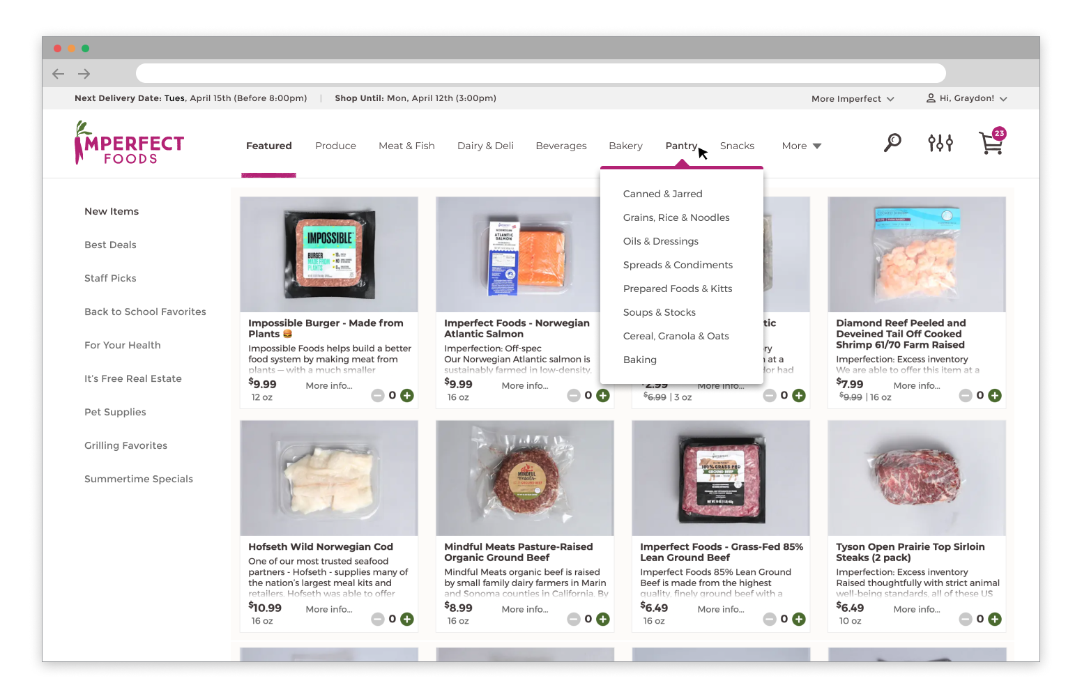
Desktop Shopping
We are a mobile first company, but saw a rise in desktop shopping during the pandemic. We wanted to take full advantage of the real estate to make shopping easy and delightful for our customers.